


Why Alt Text Matters and How to Write It Correctly

One of the worst examples of alt text I've ever found wasn't a missing image description.
It was a single quotation mark.
The person who created the page wasn't being careless. They had learned that decorative images should use an empty image description, started typing, and accidentally left behind a stray character. The page passed review because there technically was a description attached to the image. But when a screen reader user reached it, they heard punctuation where a meaningful description should have been.
That experience has stuck with me because it captures what's wrong with a lot of alt text today. Most accessibility problems aren't caused by people not caring. They're caused by people learning part of the rule without understanding the purpose behind it.
I spend my days evaluating websites, PDFs, and mobile applications for accessibility, and I see this constantly. Alt text, short for alternative text, is a short description attached to an image that helps people using screen readers understand what the image is showing. For someone who cannot see the image, that description IS the image. The question isn't whether alt text exists. It's whether it helps someone understand what the image is meant to convey.

According to WebAIM's 2026 Million Report, more than half of website homepages still contain images missing alt text, while millions more have descriptions that are vague, repetitive, or unhelpful. At a time when websites continue to become more visual, many users are still being left without access to important information.
Start With One Question
Before writing a single word, ask: "What is this image doing here?"
That question solves most alt text problems.
A photo can be the entire point of a page, or it can simply be decoration. The same image might need a detailed description on one page and no description at all on another. Good alt text describes the image's purpose, not every visual detail.
Generally, images fall into five categories:
1. It Carries Information
Describe the information that matters.
✅ "Vertical crack running the full height of a concrete foundation wall."
❌ "Photo of a wall."
2. It's Decorative
For websites and documents, if an image is only there to make the page look nice and doesn't add information, it should be marked as decorative so screen readers skip it.
Social media is often different. Even when an image isn't conveying critical information, it may still provide context about who is present, what is happening, or the setting of a photo. In those cases, a brief description of the people and scene can help users understand the content being shared.
If an image contains important text, that information should also appear in plain text within the page, post, or document. People shouldn't have to rely on an image alone to access important information.
3. It Performs an Action
If an image functions as a button or link, describe what it does.
✅ "Search"
❌ "Magnifying glass"
4. It Contains Text
Repeat the text shown in the image unless those same words already appear nearby.
5. It's Complex
Charts, graphs, and infographics usually contain too much information for a short image description. Give a brief label and include the detailed information within the page content itself.
Common Examples
Product Photo

Before: IMG_2043.jpg
After: Navy canvas work apron with three front pockets.
The file name tells someone nothing. The description provides the information a sighted shopper would pick up at a glance.
Headshot Beside a Biography

Before: Photo of Aaron Linson smiling in a white shirt
After: Decorative image
If the person's name and role already appear in the text beside the image, repeating that information creates unnecessary noise for screen reader users.
Screenshot of an Error Message
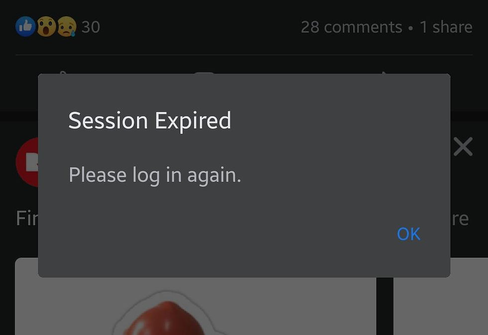
Before: Screenshot
After: Error message reading: Session expired. Please log in again.
Screenshots containing text are one of the most common accessibility issues I encounter. Often, the solution is simply typing out what the image says.
Bar Chart in a Report

Before: Bar chart showing 2020 student enrollment at 4000 students, up from 1500 in 2019, 3500 in 2018, and 2600 in 2017
After: Bar chart of annual student enrollment by year.
The detailed numbers should appear in the body of the report where everyone can access them, not hidden inside an image description.
The Read-Aloud Test
The one piece of advice I give every team is simple:
Read the surrounding content aloud and substitute the image with its alt text. If the content still makes sense and nothing important is missing, you're probably done.
If it sounds repetitive, the image may be decorative. If it feels like information disappeared, the description likely needs more work.
This simple exercise settles most of the questions people spend hours debating.
Quick Tips
Skip phrases like "image of" or "photo of." Screen readers already announce images.
Focus on purpose, not every visual detail.
Keep descriptions concise.
Use empty alt text for decorative images.
For charts and infographics, provide the details within the page content.
Treat AI-generated alt text as a first draft, not a final answer. AI can identify objects in an image, but only a human understands why the image is there.
How to Get Started
Pick one page you own. Not your entire website. Just one page.
Go through every image and ask the same question: What is this doing here?
Write the description, read it back in context, and move on to the next image.
Accessibility isn't usually fixed in one massive project. More often, it's improved one image, one sentence, and one decision at a time. Effective alt text is one of the simplest ways to make digital content more usable and inclusive for everyone.
The Part People Get Stuck On
I've taught alt text to hundreds of people, and the biggest challenge is always the same: figuring out whether a description is enough.
What's clear to someone who can see an image isn't always clear to someone who can't. As the person writing the description, you're already looking at the image, so it's easy to assume you've included the important details.
When possible, test your alt text the way it will actually be used. Have someone read the description without showing them the image and ask them to explain what they think is there. If their understanding is vague or inaccurate, your description probably needs more work.
Frequently Asked Questions About Alt Text
What is alt text?
Alt text, short for alternative text, is a brief description attached to an image. It helps people using screen readers understand what the image is showing.
Who benefits from alt text?
Alt text primarily helps people who are blind or have low vision, but it can also benefit users with slow internet connections, people who disable images, and search engines.
How long should alt text be?
Most alt text should be one or two short sentences. Focus on the information the image is meant to convey rather than describing every detail.
Should I use alt text for decorative images?
It depends on the context.
For websites, if an image is purely decorative and doesn't add information, it should be marked as decorative so screen readers can skip it. This helps reduce unnecessary noise for users.
For social media, the approach is often different. Social media images are frequently meant to communicate context, mood, people, or activities, even when they don't contain critical information. In those cases, it's usually helpful to include alt text that describes who is in the image and what's happening in the scene.
If a decorative image contains important text, that text must be available in plain text somewhere on the page, post, or document.
Is AI-generated alt text good enough?
AI-generated alt text can be a helpful starting point, but it often misses the purpose or context of an image. Human review is still important.
What's the easiest way to test alt text?
Read the surrounding content aloud and substitute the image with its alt text. If the content still makes sense and nothing important is missing, the description is likely doing its job.
Learn More About Writing Alt Text
About The Author
Aaron Linson specializes in evaluating websites, PDFs, and mobile applications for accessibility. He helps organizations identify barriers that affect people with disabilities and tests digital experiences against WCAG 2.2 Level AA standards. Aaron is also a Certified Professional in Accessibility Core Competencies (CPACC).
Need help improving the accessibility of your website, PDFs, or digital content?
Disability Solutions provides expert accessibility audits, testing, and guidance to help organizations identify barriers and create more inclusive digital experiences.


Comments